concept 2
concept 3
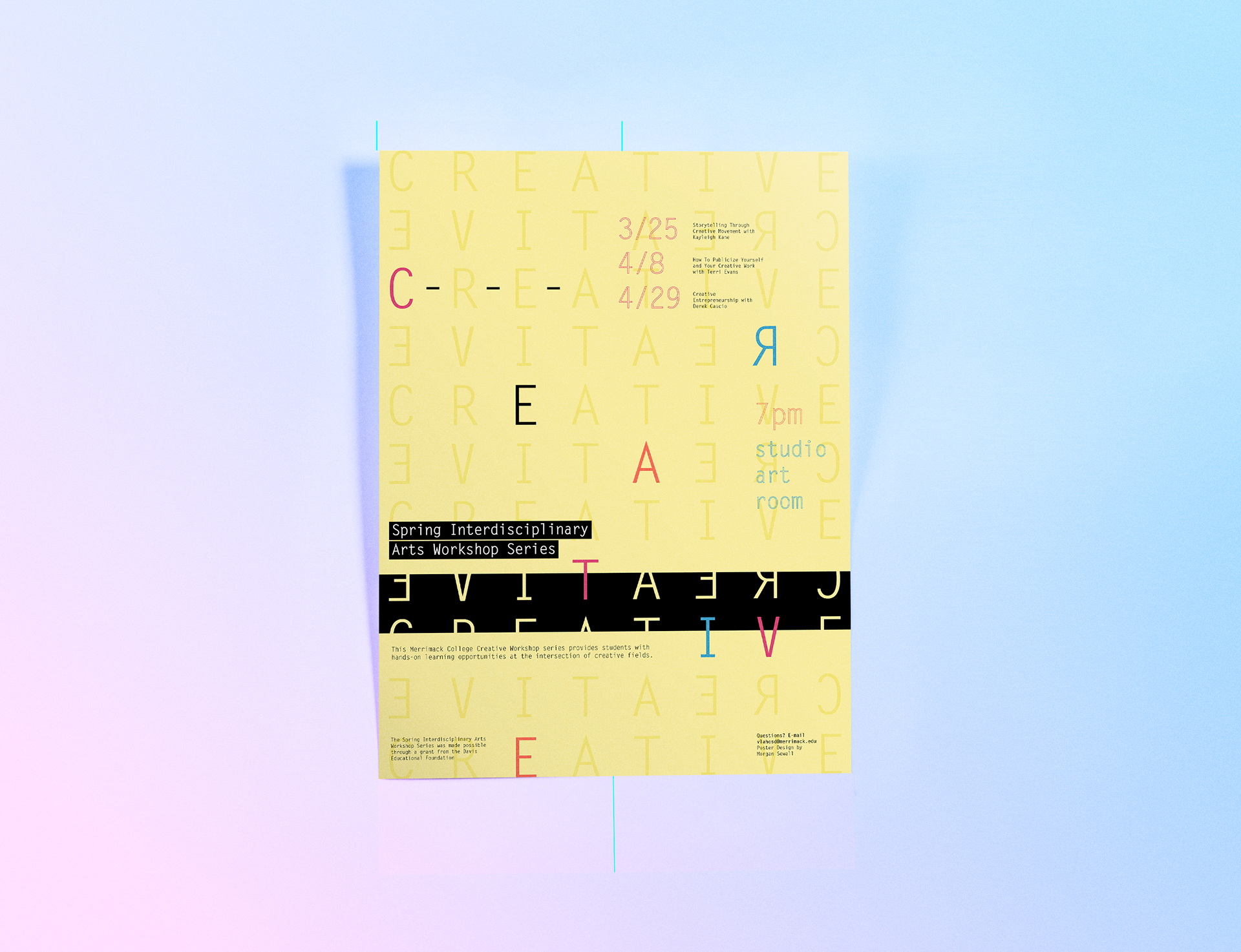
Spring Interdisciplinary Arts Workshop Series Poster
I was asked by my professor to work on a side project for an upcoming arts workshop series that would be offered to students in the Visual and Performing Arts department at Merrimack College. He needed a poster that would not only catch students eyes but also give off the unique creative learning vibe that these three different workshops would offer these students. The intention of the poster was to inform people about what the workshops were, when they were happening, and who the workshops were for. The poster was supposed to intrigue students, encouraging them to sign up for the workshops.
Target Audience: Visual and Performing arts students at Merrimack College
Role in Projects: I was given the information that needed to be on the poster, but I was the complete concept creator and visual creative director throughout the process of creating the poster.
Skills: Creative concept directing, typographic layout and design, creative analysis for visual translation
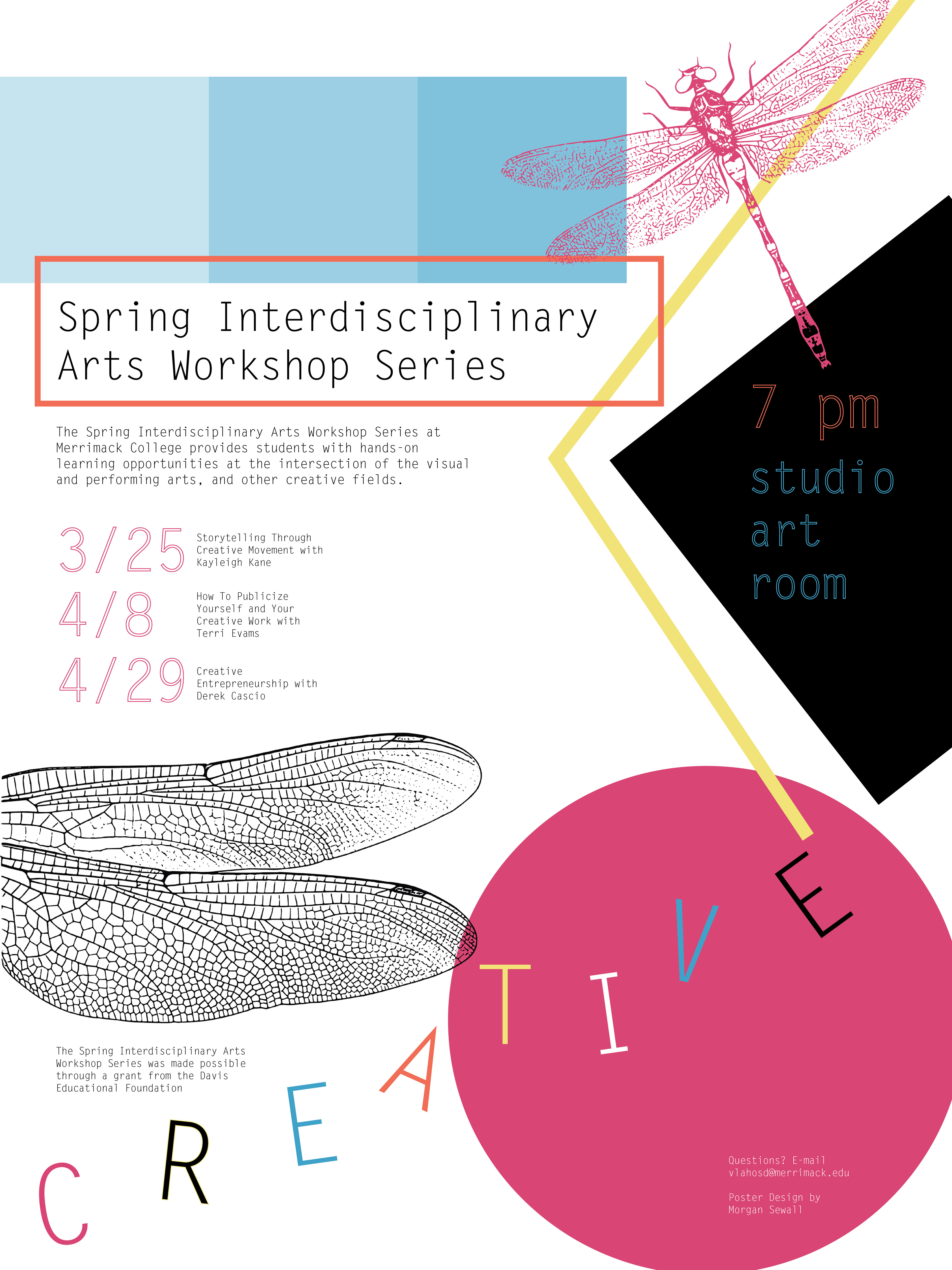
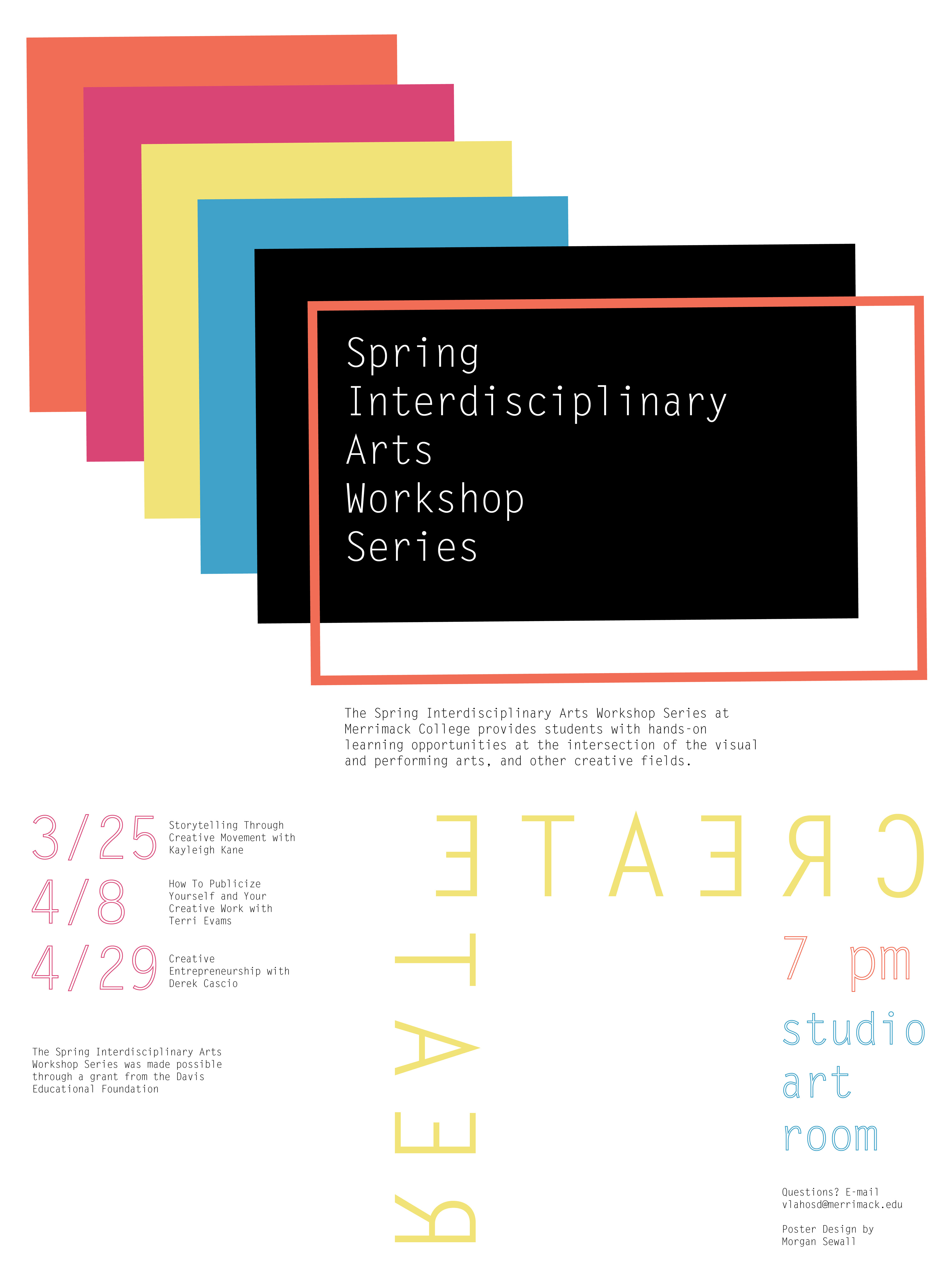
Process: I came up with three original concepts based on the information I was given about the series and started the creative process by writing down words that came to mind about how the workshop series should be marketed. I thought the design should be colorful, structural and linear, with some sort of high contrast in the layout. I came up with the three concepts shown, but my professor loved the direction of the top one, so I continued to work on the layout and organization of information within the design until this finished product was created.
Process: I came up with three original concepts based on the information I was given about the series and started the creative process by writing down words that came to mind about how the workshop series should be marketed. I thought the design should be colorful, structural and linear, with some sort of high contrast in the layout. I came up with the three concepts shown, but my professor loved the direction of the top one, so I continued to work on the layout and organization of information within the design until this finished product was created.
Duration: The entire design and creation process took about five days.
Challenges & Successes: My main challenge with this project was holding back on the amount of elements I put in the poster. I tend to be a "more is more" person, so typographic layouts can be especially challenging for me. I pushed myself with this concept though and feel as though my strength in this layout was the way I used contrasting color and typography to put emphasis on certain pieces of information within the poster.

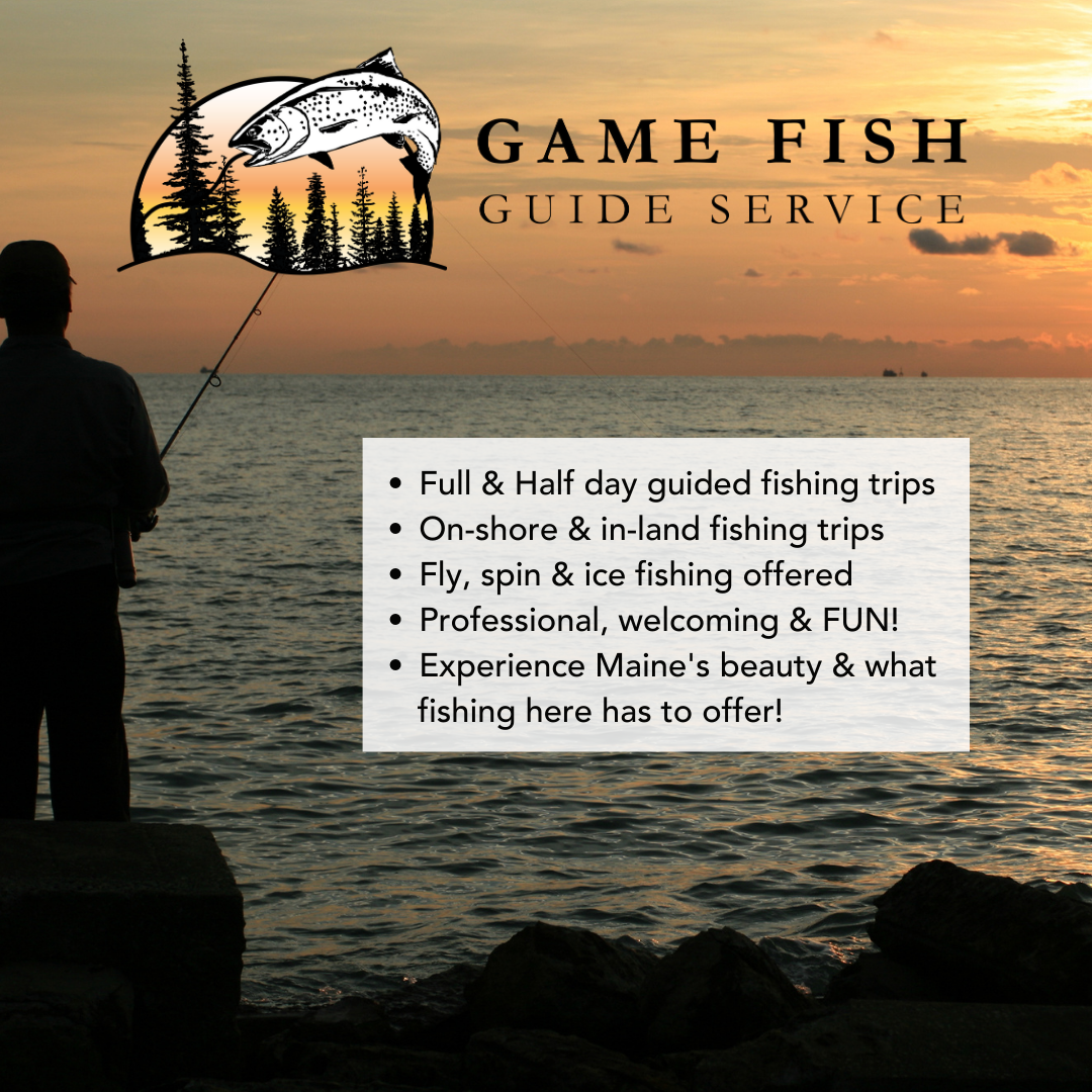
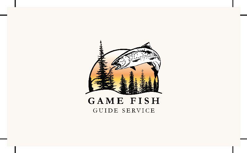
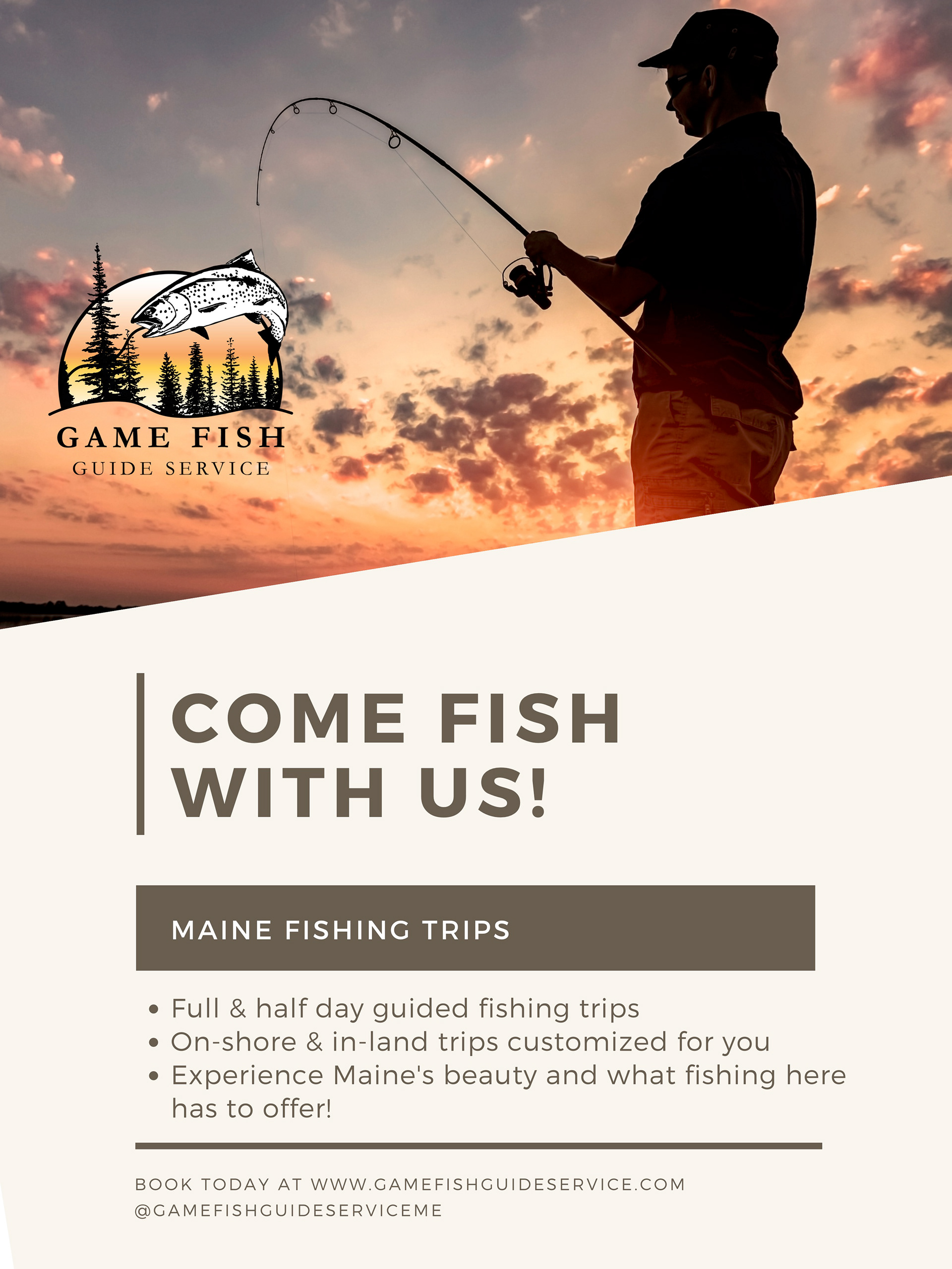
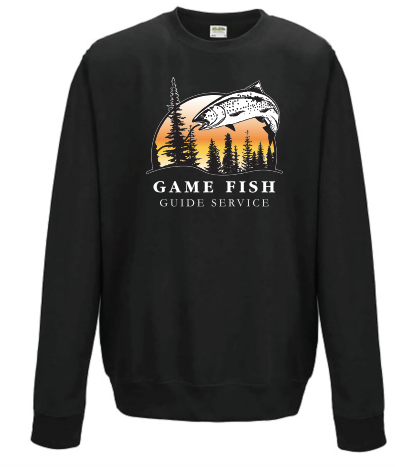
Game Fish Guide Service Brand Identity and Website Design
I was hired by a small, local Portland, ME fishing charter startup to build their brand and website to kickstart their business. I was in charge of designing the logo, brand identity, and used Wix to design and copy write all of their website components.
Target Audience: Anyone interested in an authentic Maine fishing trip. Also the local fishing community.
Role in Projects: Complete direction in branding design and website design.
Skills: Branding identity, UX design, web design
Process: I started the project by conversing with GFGS about what their core values are and what they wanted to communicate to their customers through their branding. After this I created a bunch of different logo concepts where we then went through a refining process together, to eventually settle on one final logo. From here I developed the fonts and color scheme for the brand and put together a brand guide to follow. I then moved onto designing the website using this branding guide. I had a list of all the elements that were required on the site, and using the various Wix integrations, built gamefishguideservice.com using the brand guidelines I had created.
Process: I started the project by conversing with GFGS about what their core values are and what they wanted to communicate to their customers through their branding. After this I created a bunch of different logo concepts where we then went through a refining process together, to eventually settle on one final logo. From here I developed the fonts and color scheme for the brand and put together a brand guide to follow. I then moved onto designing the website using this branding guide. I had a list of all the elements that were required on the site, and using the various Wix integrations, built gamefishguideservice.com using the brand guidelines I had created.
Duration: Logo and branding creation took approximately a month. The Website took 2 weeks... A running business was up approximately 6 weeks after I was hired.
Challenges & Successes: My main challenge with these tasks was building the website within the limitations of Wix. I find that website builders such as Wix are extremely easy to work with and are helpful in the speed at which I can design, until the integrations don't line up with what the client needs. We were able to adjust and work around these problems in the end. Because of this, I have found I have great problem solving skills in regards to design and user experiences and think my greatest success was the creation and following of my branding for this company.
Check out their website @ gamefishguideservice.com

logo horizontal
social media post
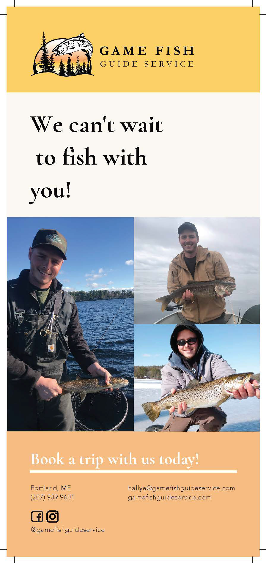
rack card back
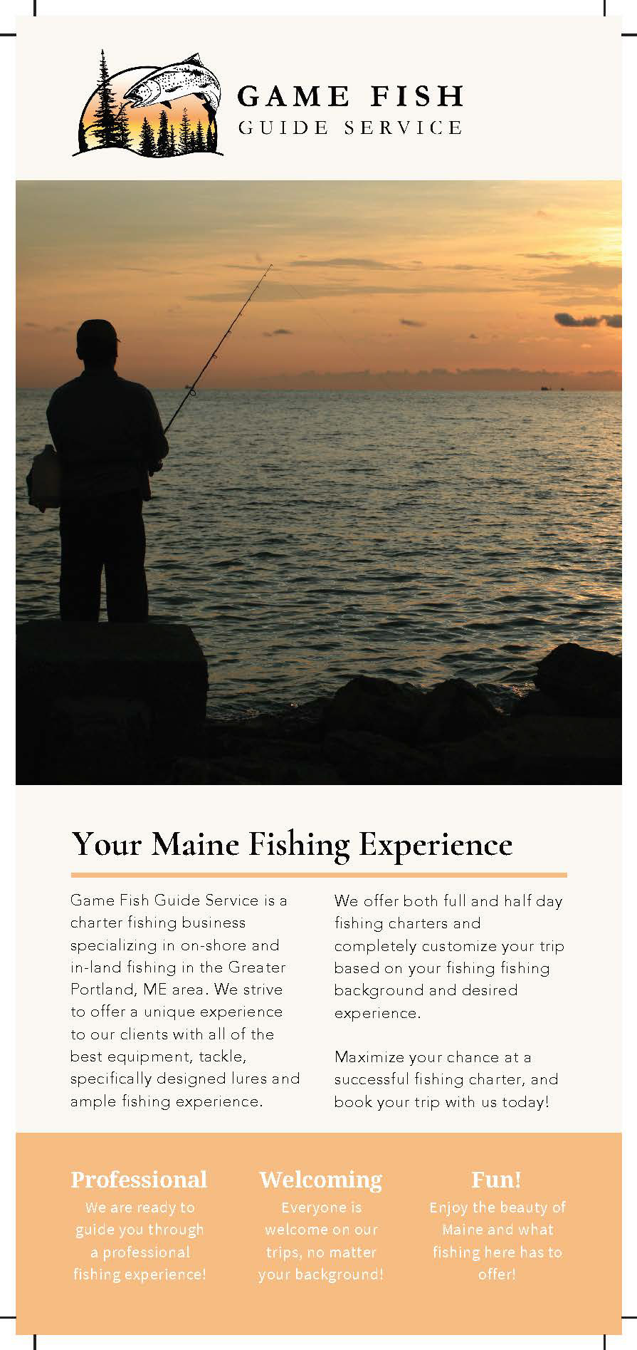
rack card front
business card back

business card front
flyer
Merch Mockup

Merch Mockup

Instagram Feed

Instagram Feed

Instagram Feed
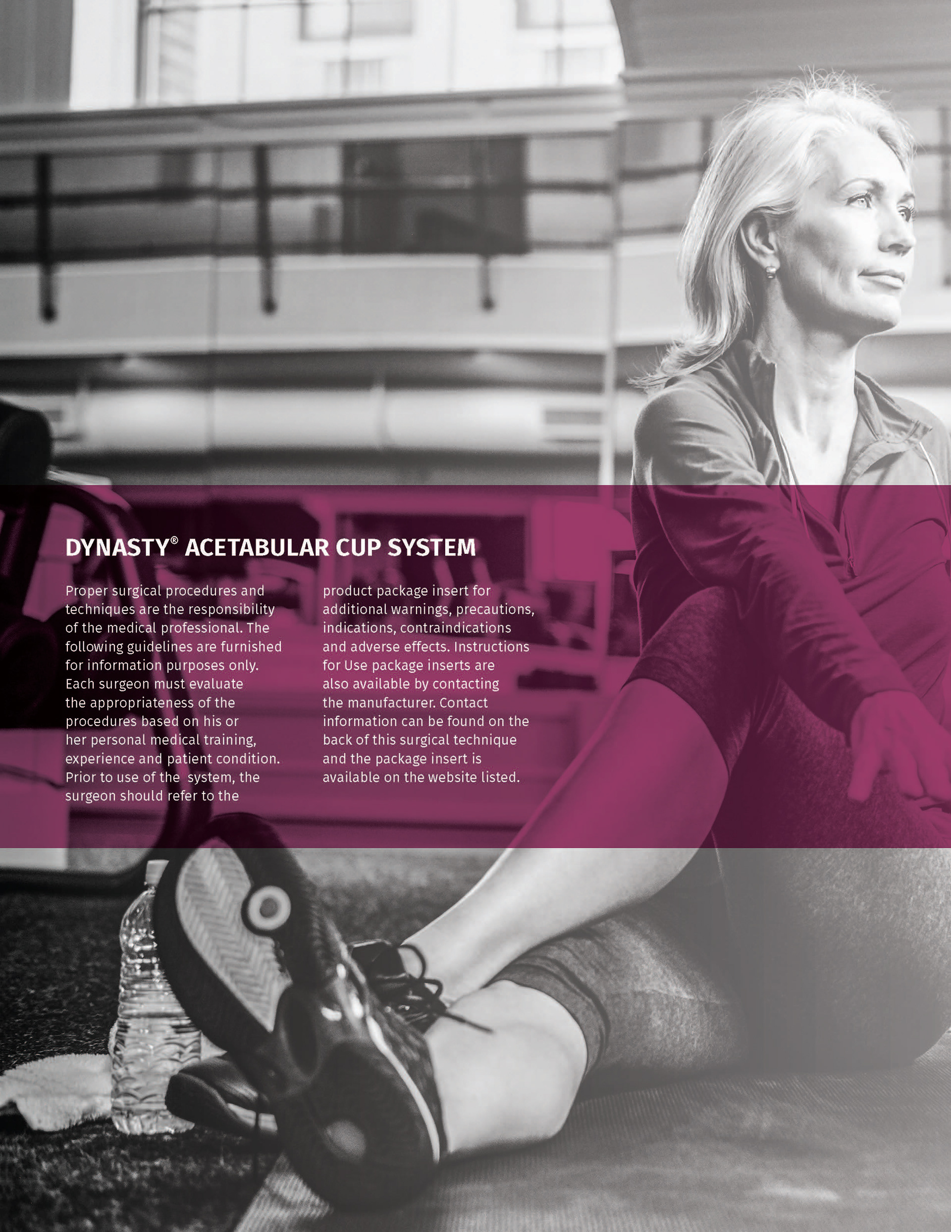
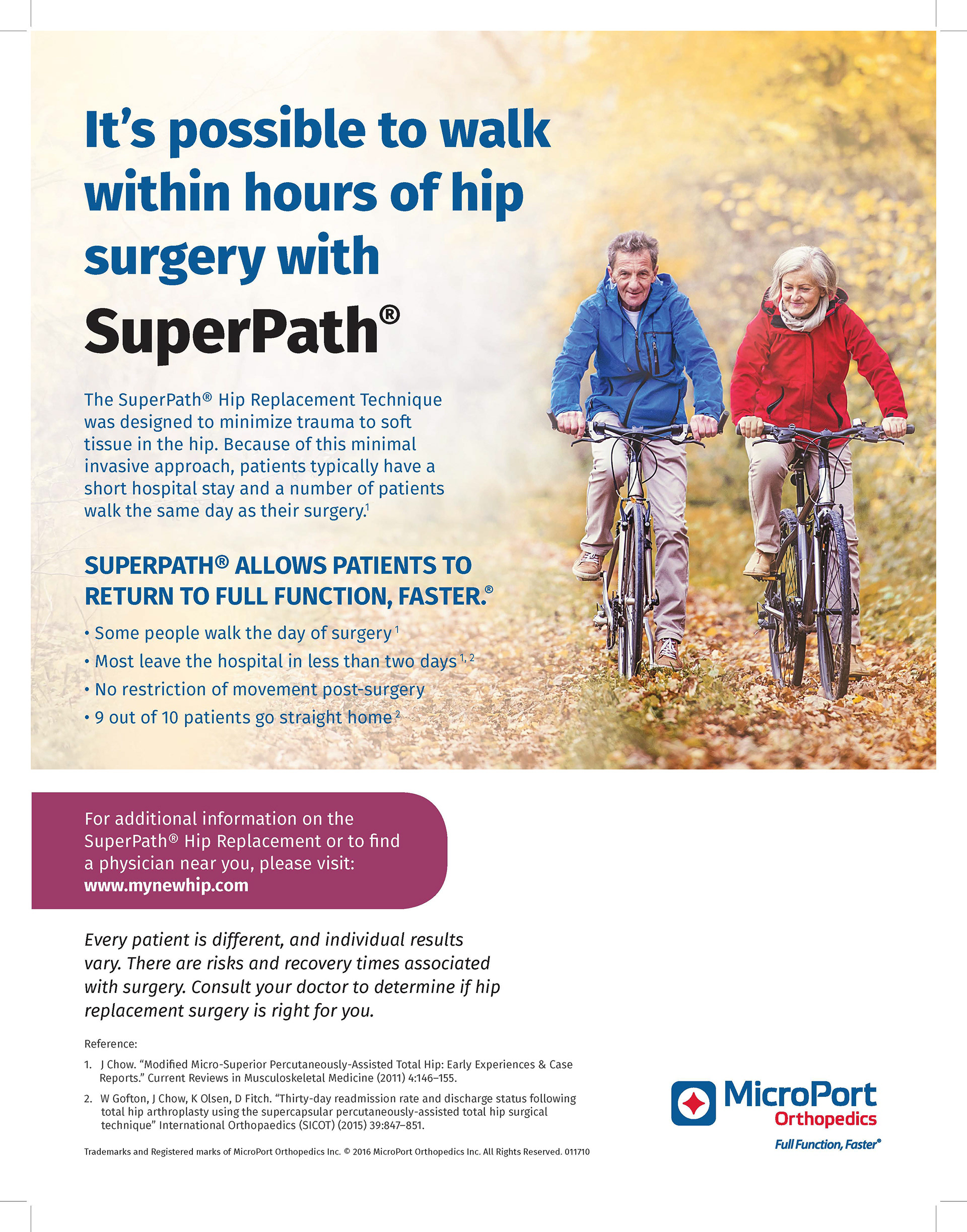
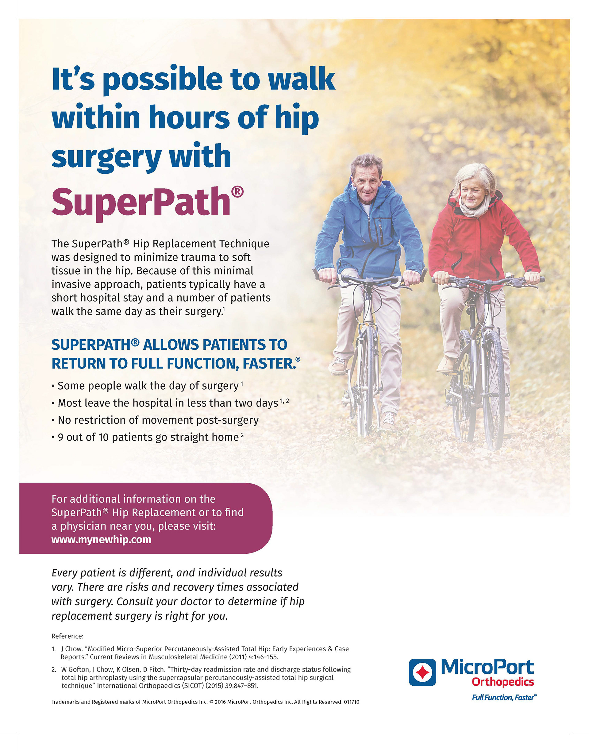
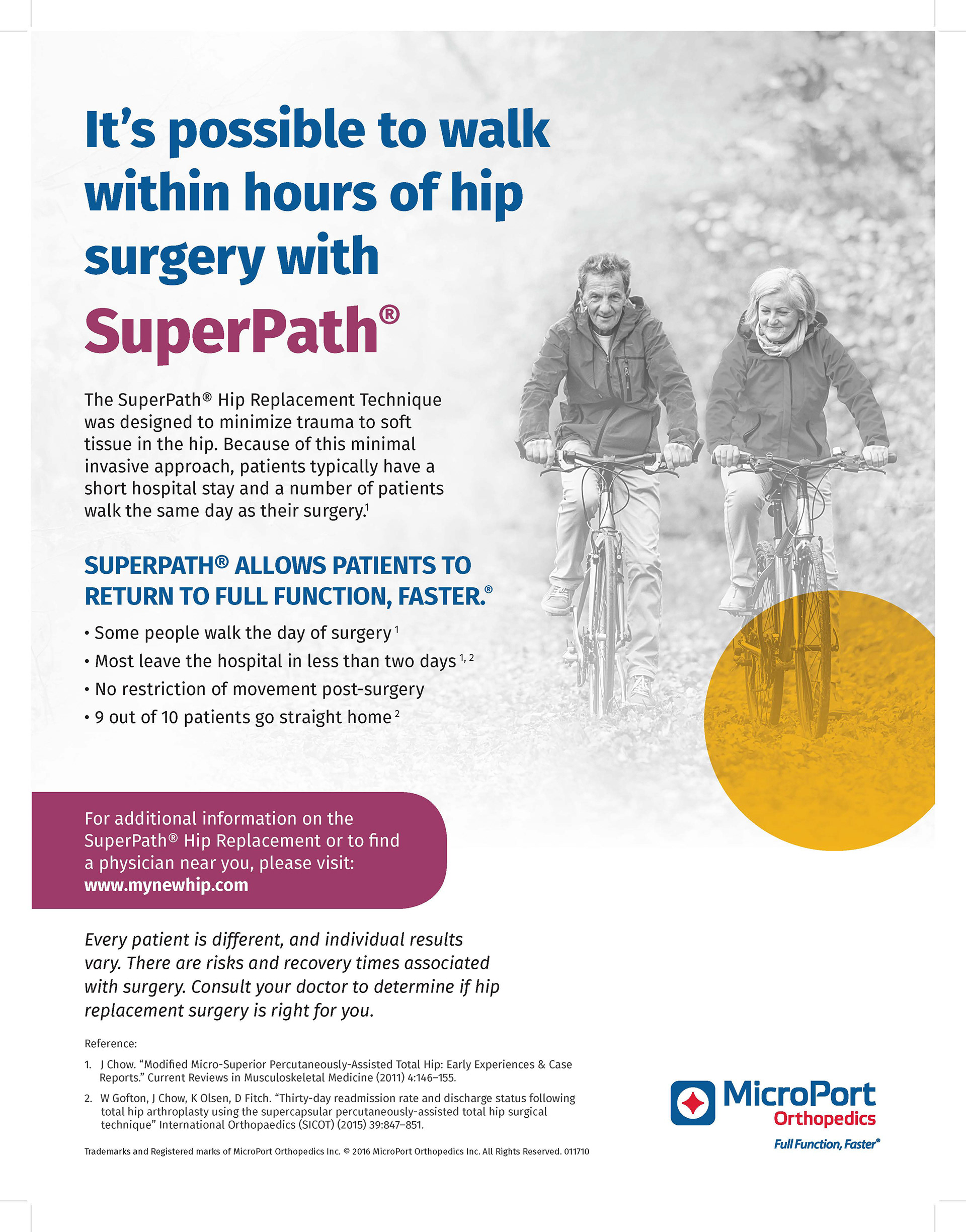
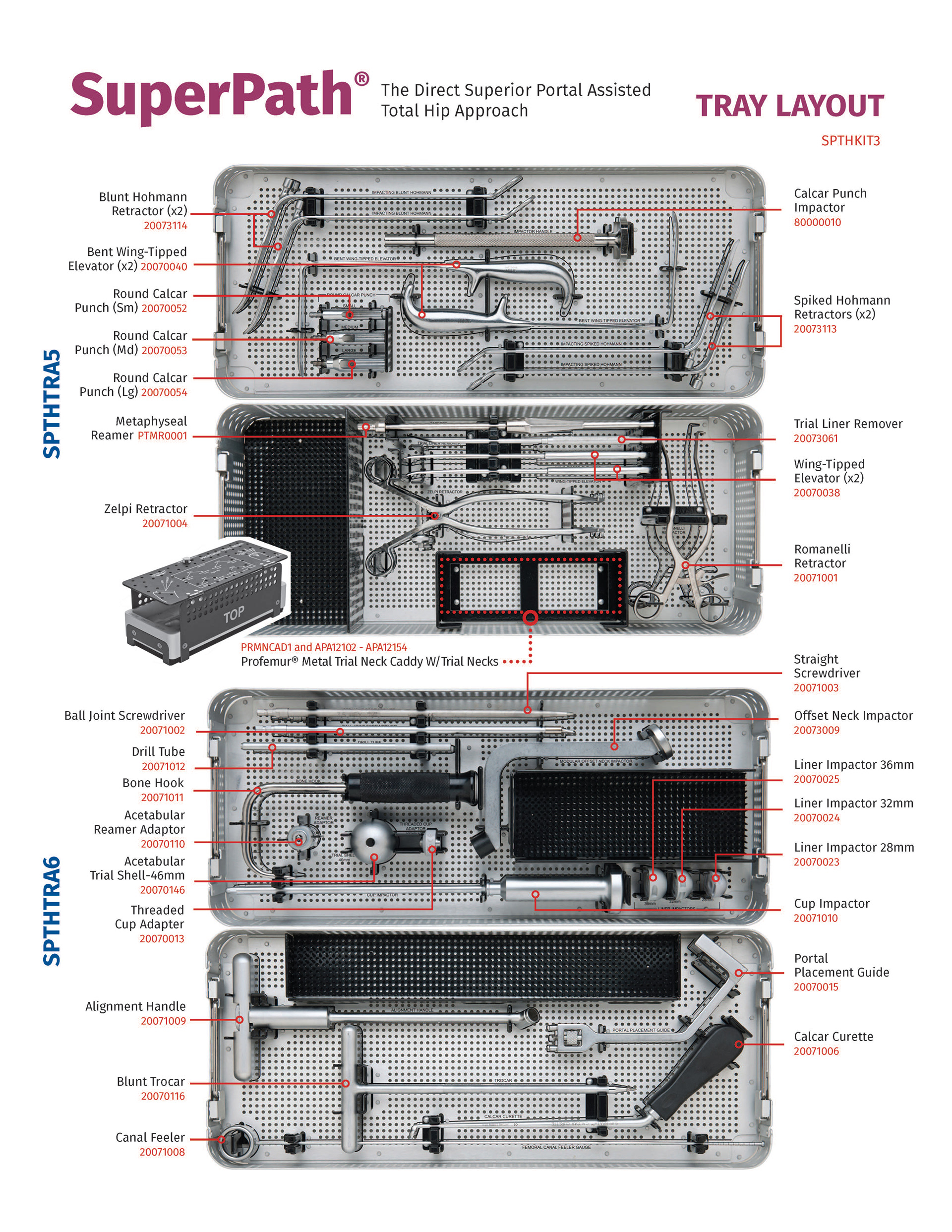
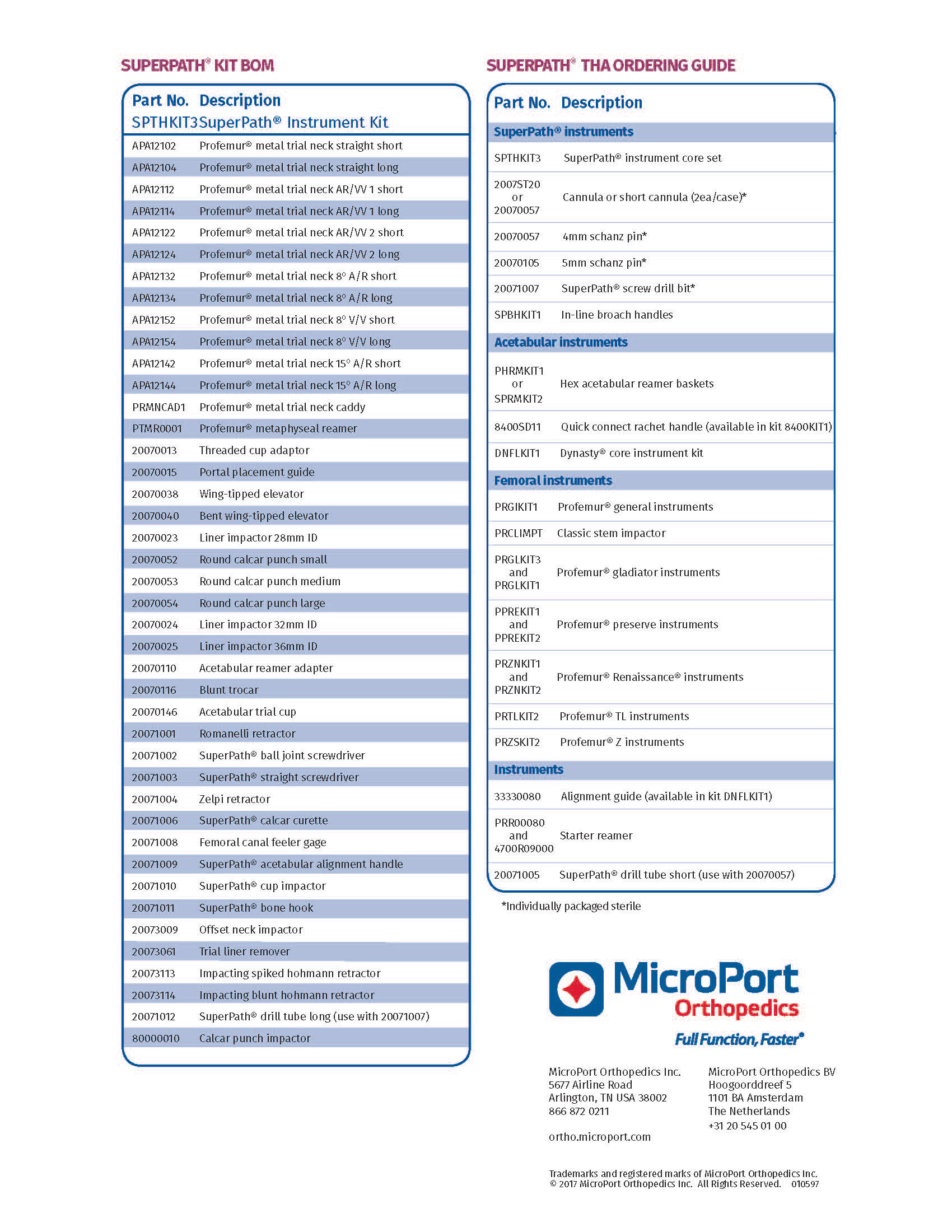
MicroPort Orthopedics Freelance Work
I was hired by a joint replacement company, MicroPort Orthopedics, to work on the rebranding of all of their print materials. I was given the original design files for every project, as well as a booklet of their new brand guidelines, and I was in charge of redesigning the materials to fit these new guidelines.
Target Audience: Surgeons, other doctors and patients of MicroPort Orthopedics.
Role in Projects: Complete direction in rebranding design of surgical manuals and marketing materials.
Skills: Following brand guidelines, redesigning previously created materials
Process: I would be given the current design file and asked to redesign it following the new brand guidelines. I would start from the cover and go page by page making sure the typography, colors, imagery and layout were all changed to meet new brand guidelines.
Process: I would be given the current design file and asked to redesign it following the new brand guidelines. I would start from the cover and go page by page making sure the typography, colors, imagery and layout were all changed to meet new brand guidelines.
Duration: Each project varied in length, but the lengthier projects of over 20 pages typically took between 20-25 hours to complete.
Challenges & Successes: My main challenge with these projects was the length of some of them. I found the rebranding process quite monotonous, but very rewarding once the process was over. I think I do have strong rebranding skills as I am able to work quickly when given specific details on what needs to be done.